
Most of my work lives here.
I spent the majority of my career in print companies, where I learned the foundations of design; from layout and color to the technical details that make a piece production-ready.
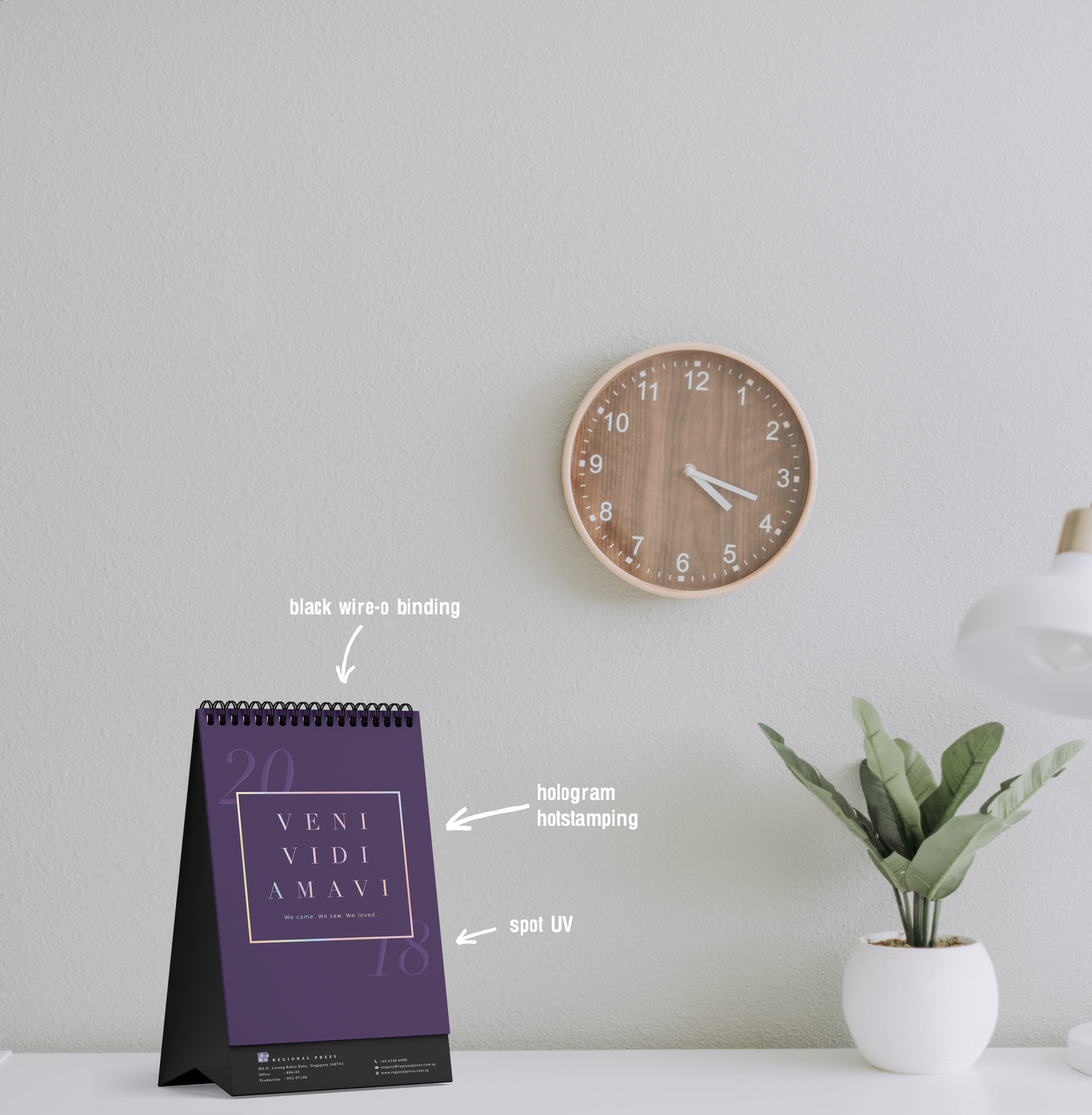
Every year at Regional Press, we conceptualised, designed, and printed our own desk calendars to give out to clients. This was something we always looked forward to, using it as our creative outlet apart from the company's daily projects
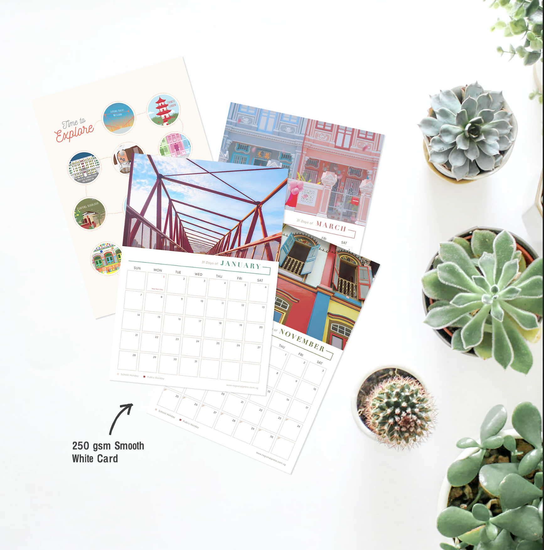
Every year at Regional Press, we conceptualised, designed, and printed our own desk calendars to give out to clients. This was something we always looked forward to, using it as our creative outlet apart from the company's daily projects.
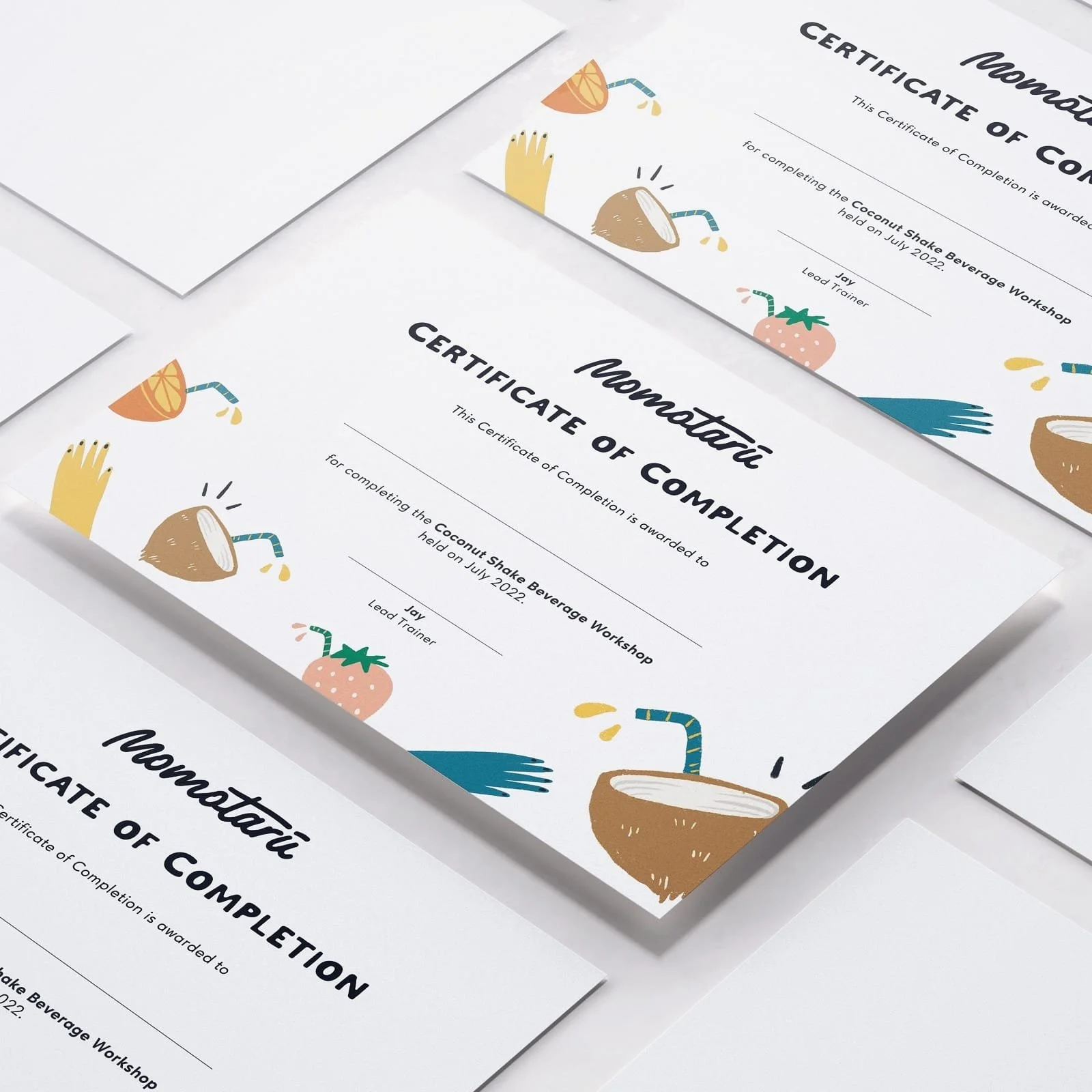
At Regional Press, I was tasked with designing a training certificate for Momotaru, a local shop that sells fresh fruit drinks. They wanted their certificate to reflect the vibe of their brand - bubbly, vibrant and fun.
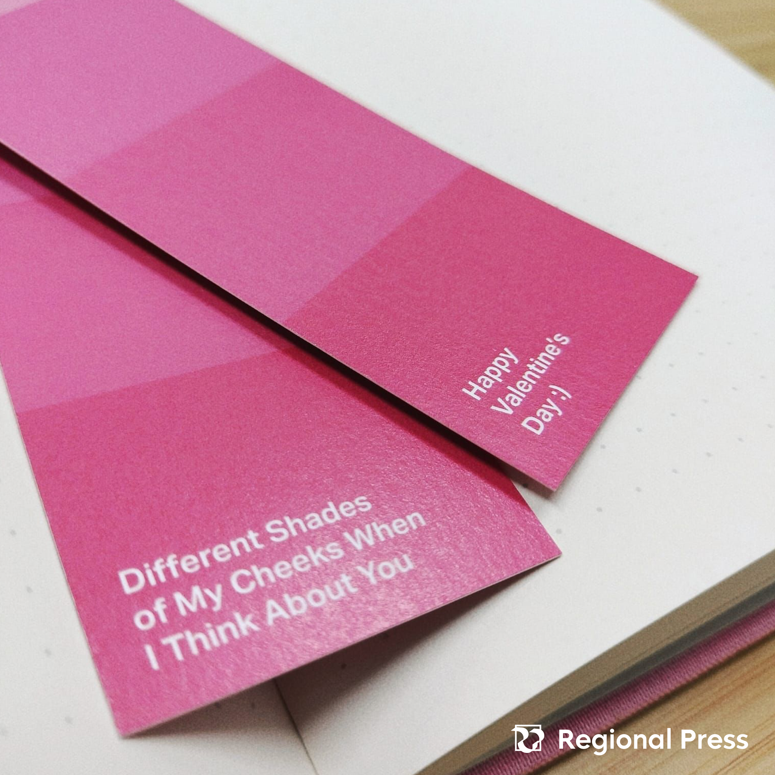
This was one of the marketing collaterals I designed for Regional Press, this time, specifically for Valentine's Day. We wanted something simple and straightforward but cute; something we can also slip into our regular deliveries and our building's mailboxes. So I came up with this lovely bookmark that mimics the aesthetic of a Pantone swatch.
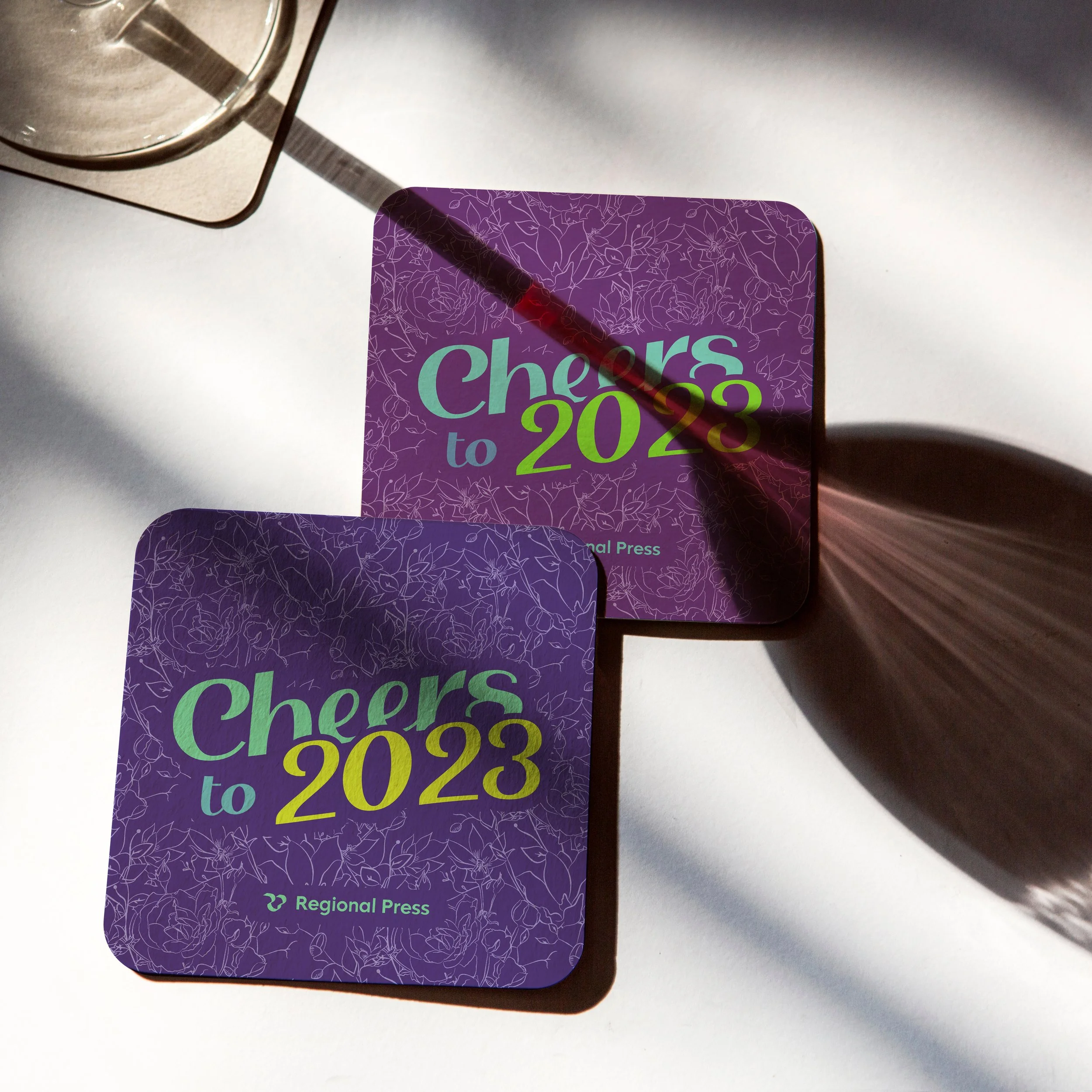
Another marketing collateral for Regional Press were these coasters that celebrated the New Year, and at the same time, showcased the company's print quality.
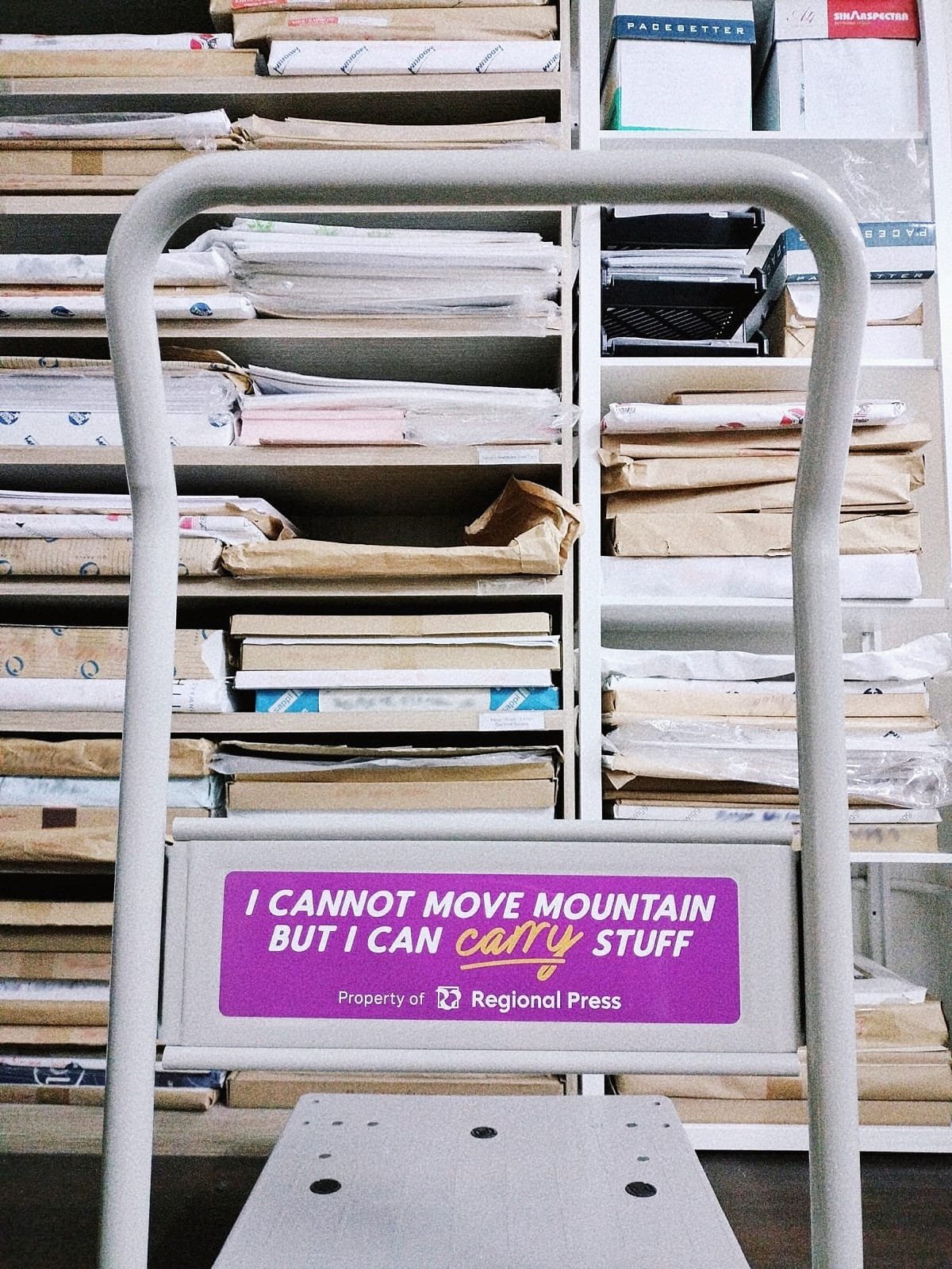
One of the things we liked doing was making sure we sprinkled subtle advertising all over the mundane. In this case, it was on this trolley which we used everyday to deliver small orders within the building.
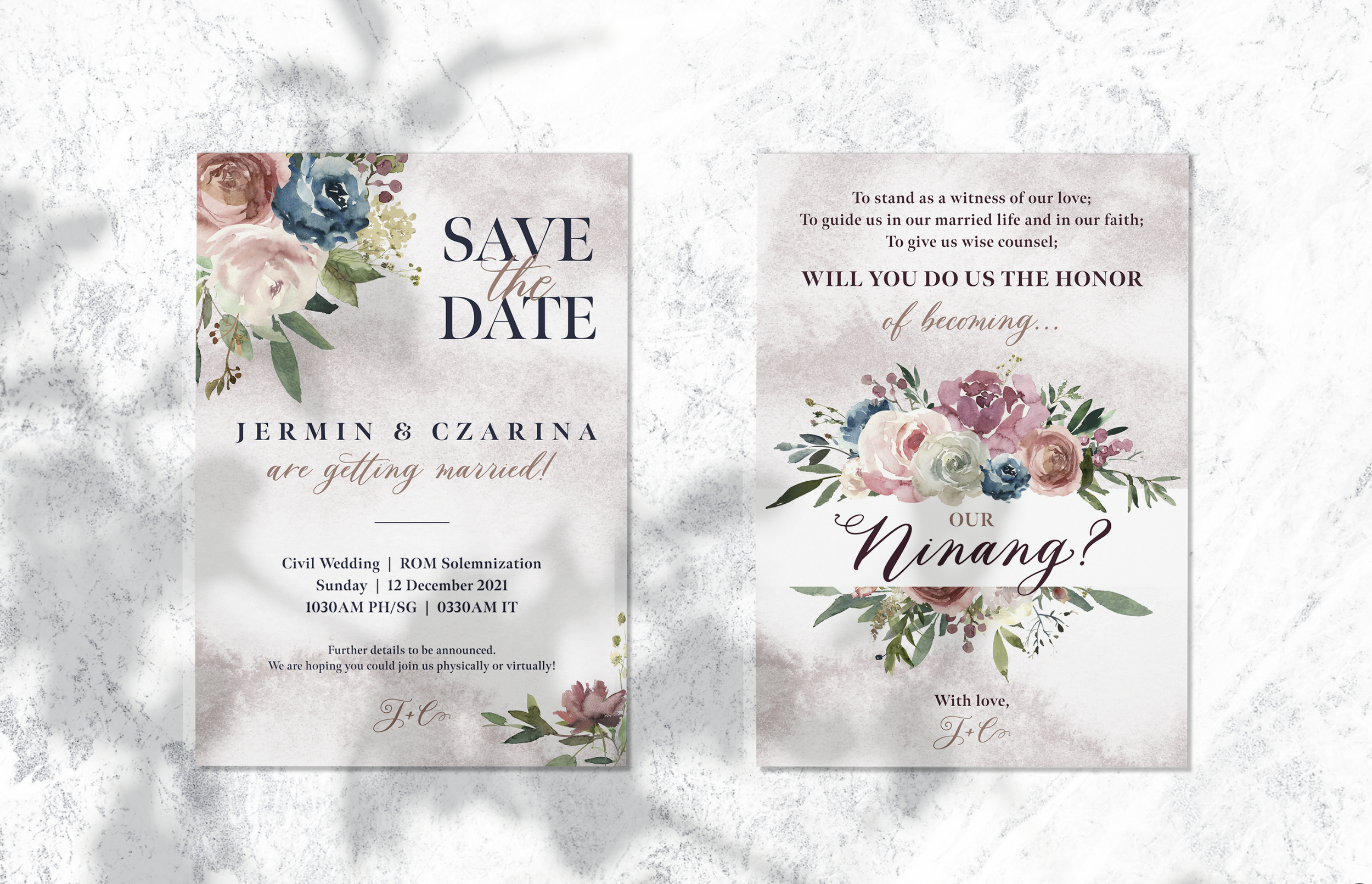
As a gift to my best friend, I designed their wedding invite which functioned both as physical cards, as well as digital invitations.

As one of my freelance projects, this was something I produced as a commission for Tanglin Trust School's Philosophy & Religious Studies Department.
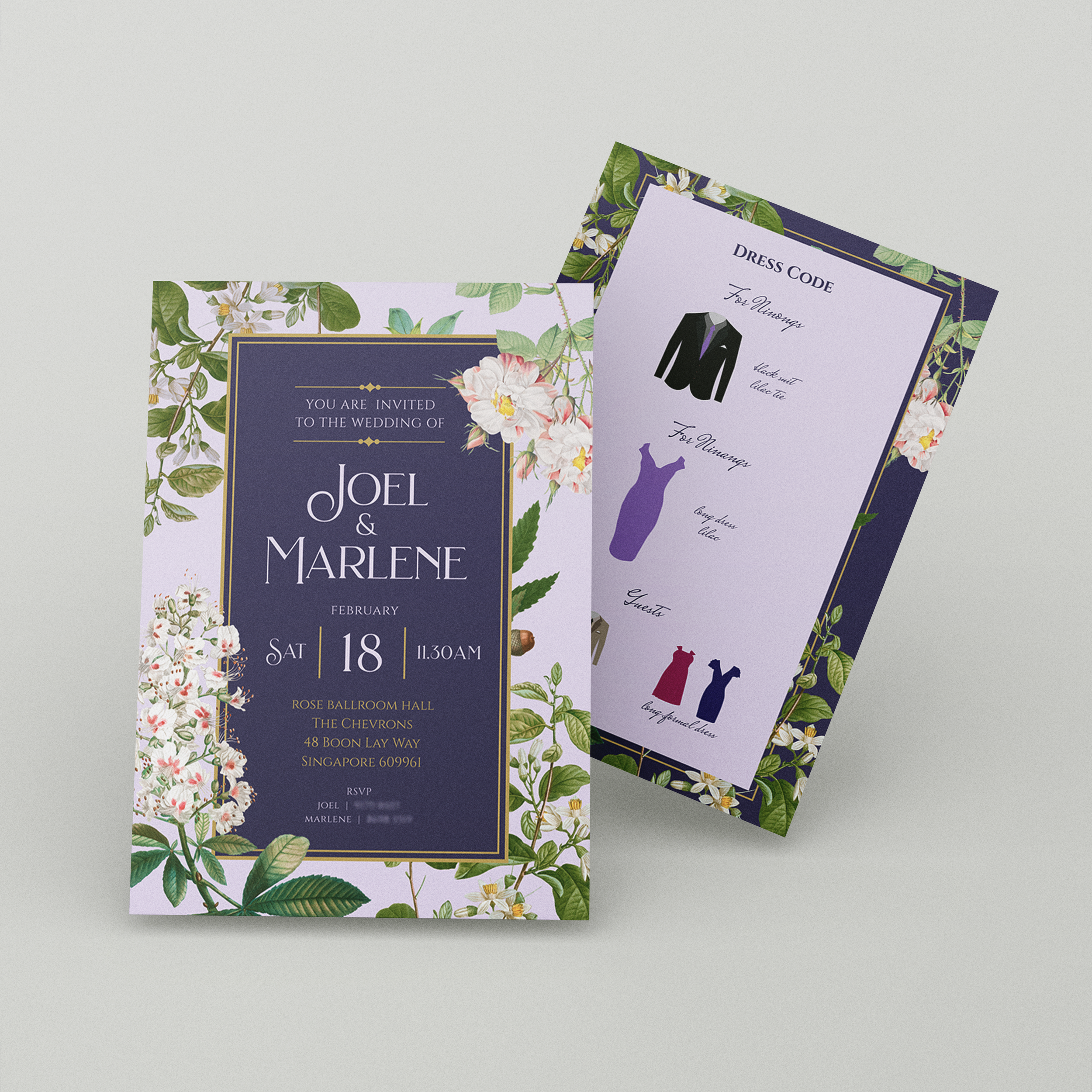
This is another wedding invite I was commissioned to do for one of my friends. The invites functioned both as physical and digital assets.
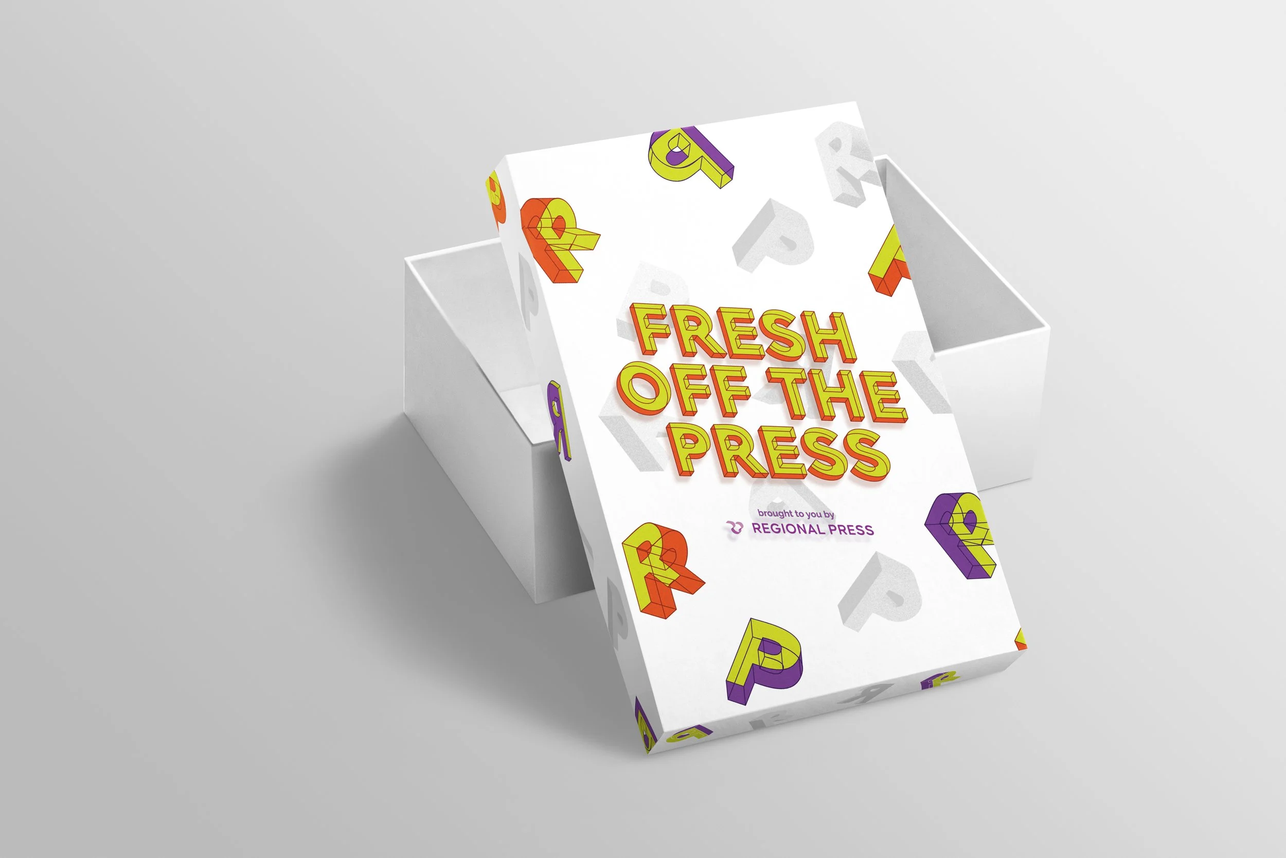
I was tasked to design the regular box we deliver our letterheads in. They wanted something fun but still not losing touch with who we are as a brand, without the company name looking overly advertised.
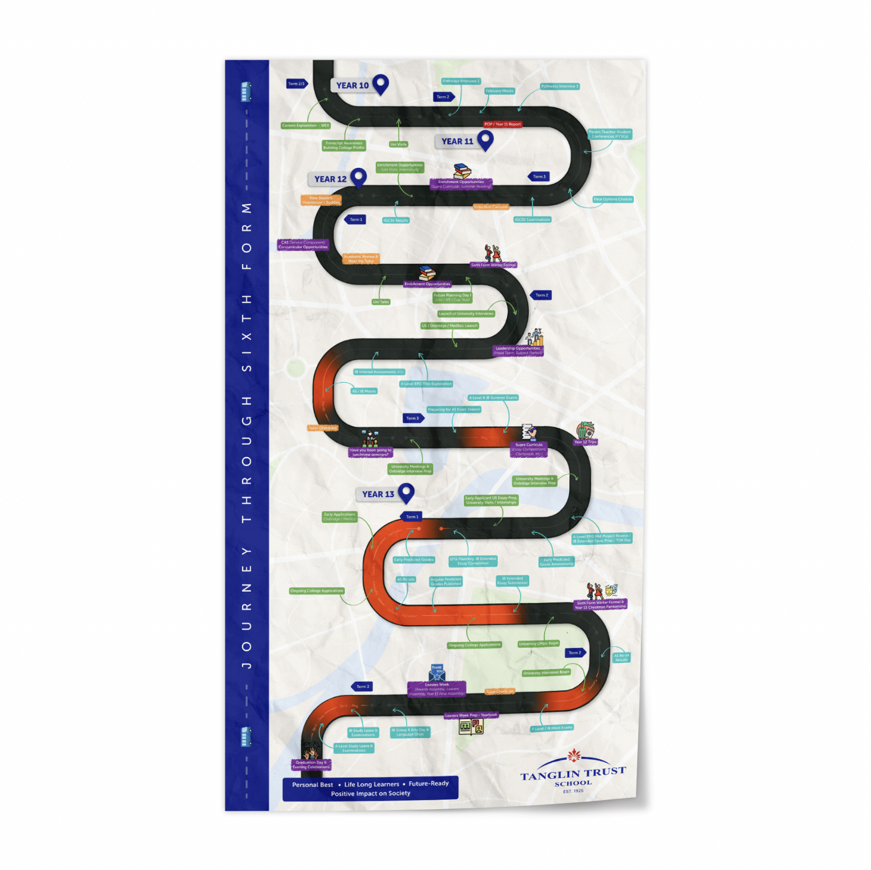
This was something I got commissioned to do for someone who was a Head of Year in Tanglin Trust School. She wanted an infographic that details all her duties and responsibilities year-round, and at the same time mapping the activities out chronologically. With this infographic, it was very important for everything to be legible and distinct from one another, so I used a consistent type size and strategic colour-coding to make everything look cohesive.
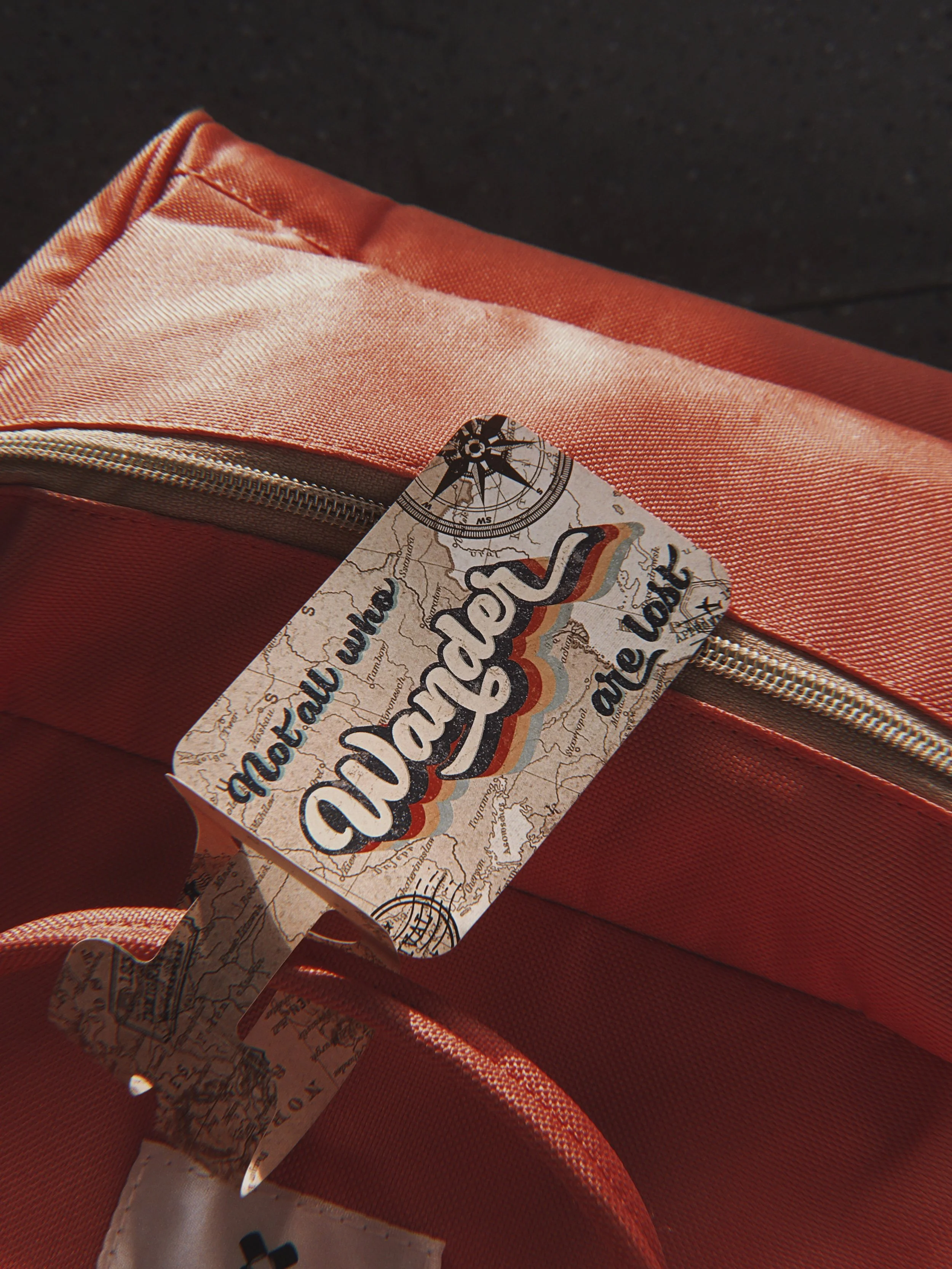
For one of my earliest marketing projects, I was given a task to make a luggage tag using one of the company's newly acquired paper material. The paper was tear-proof and waterproof so it was perfect for something like luggage tags. I designed, printed, and tested the tag myself so it oculd be a part of the company's marketing materials.
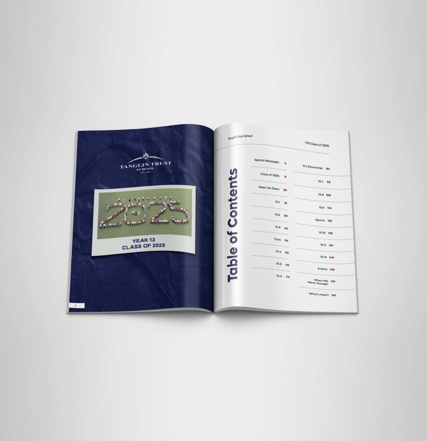
This was the first yearbook project that I was commissioned to do for Tanglin Trust School. It was a bit of a challenge with a shorter time frame, but my background in print was greatly useful for planning the layout and producing the final design with all the print requirements in mind.
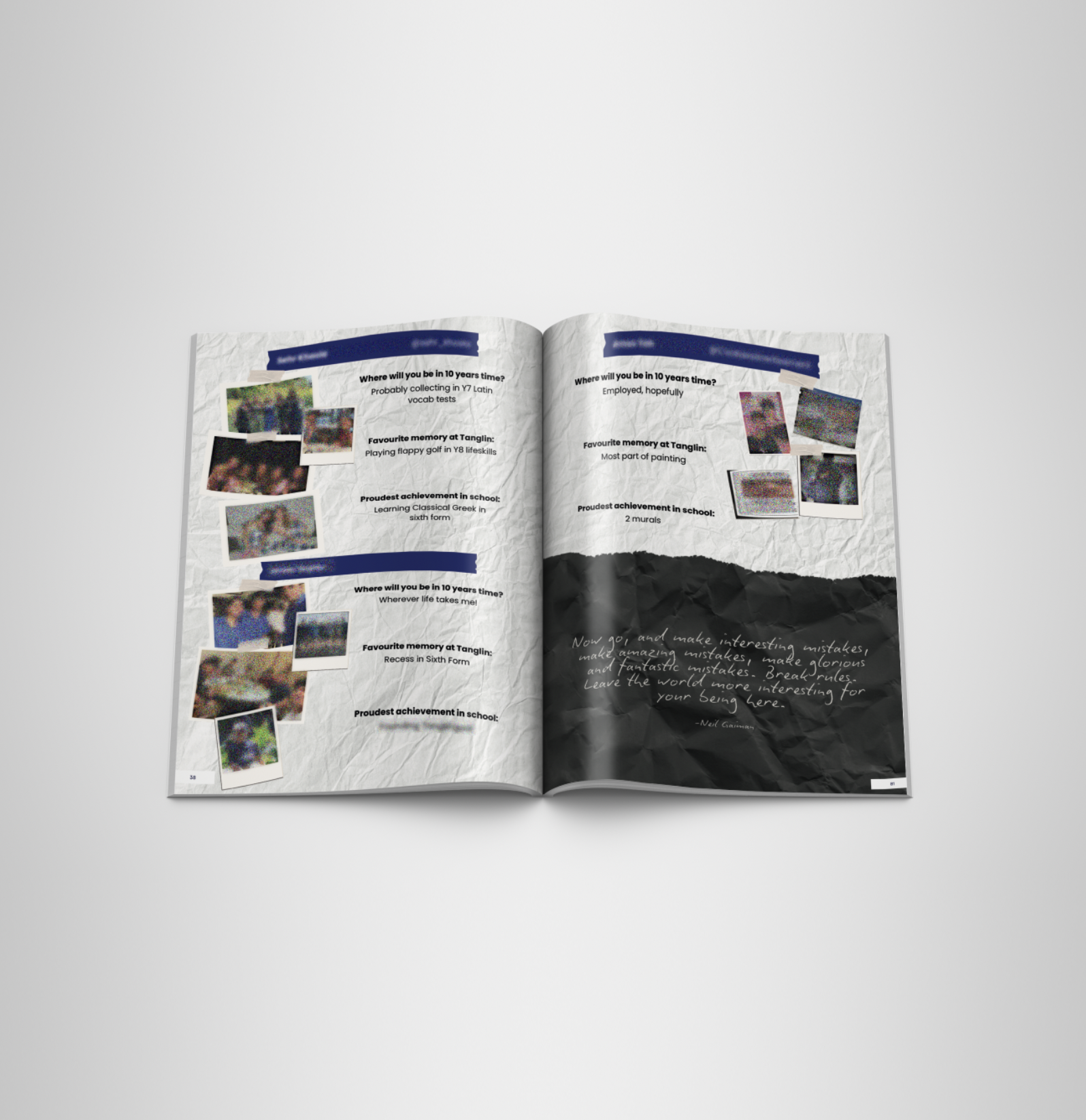
This was the first yearbook project that I was commissioned to do for Tanglin Trust School. It was a bit of a challenge with a shorter time frame, but my background in print was greatly useful for planning the layout and producing the final design with all the print requirements in mind.
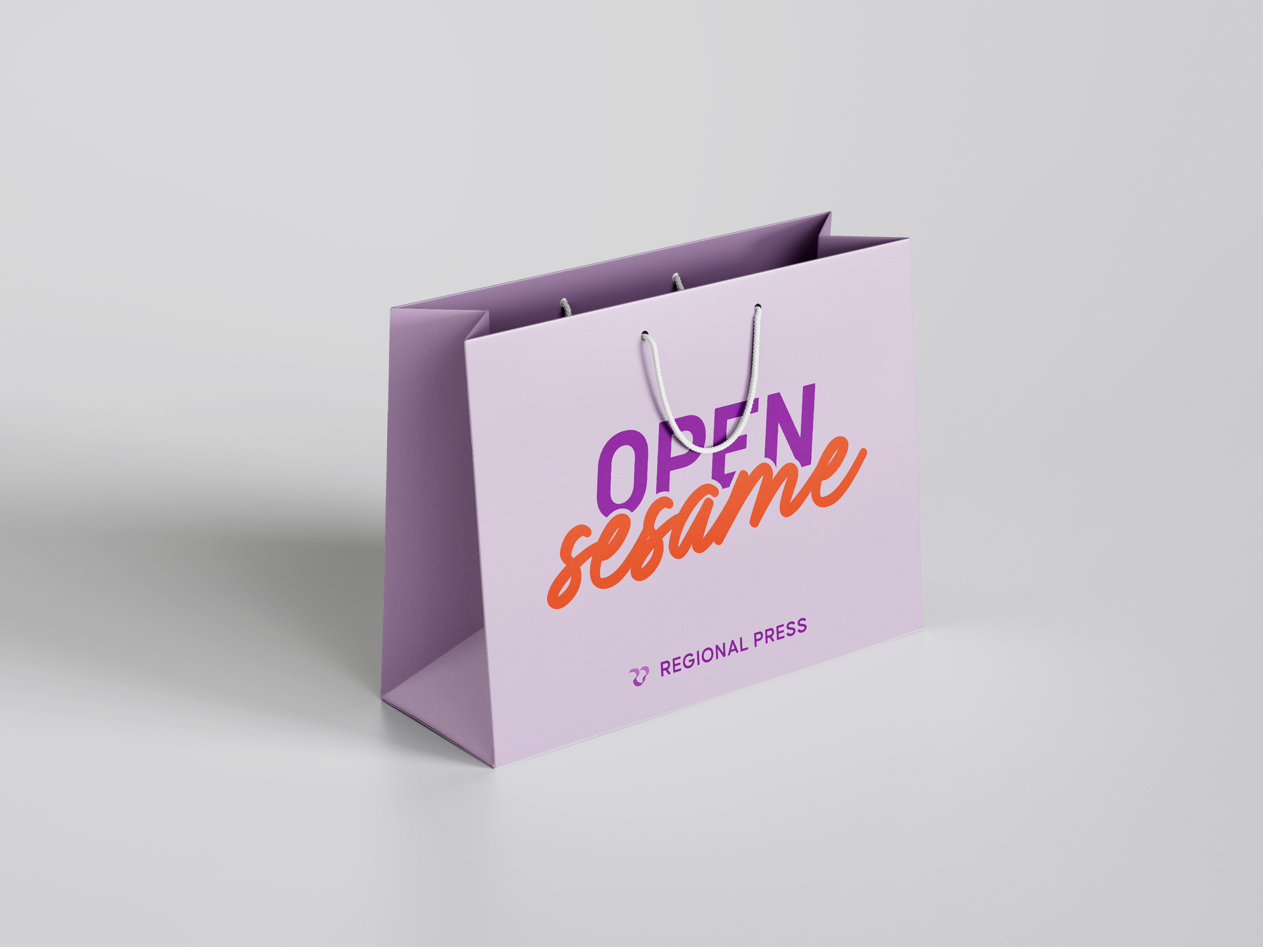
As one of their marketing collateral, I've done the same thing as the letterhead box. I made a simple paper bag as a marketing opportunity without it looking too corporate by just slapping the company name front and center.
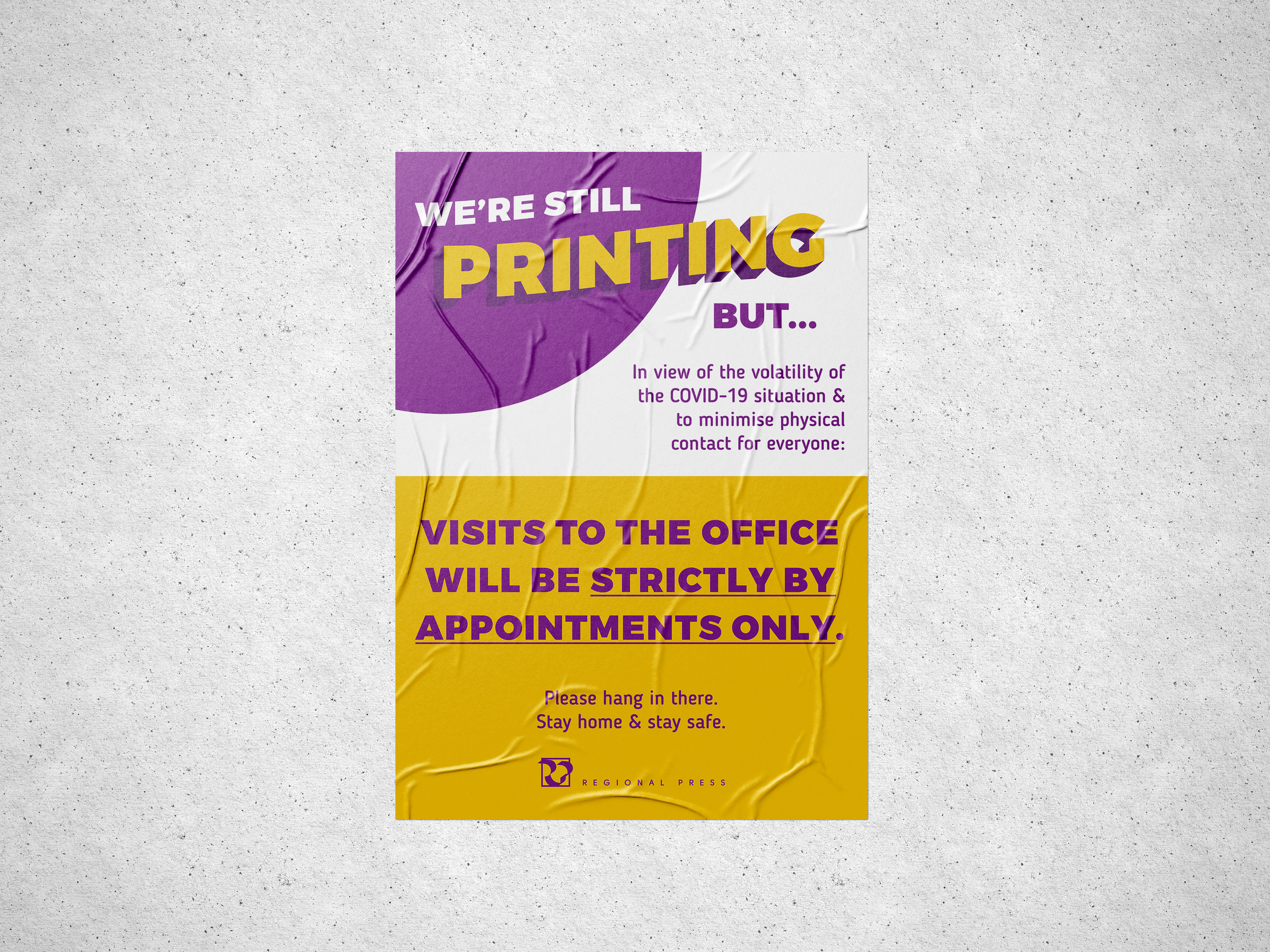
It was during COVID that the opportunities for print advertising dwindled down tremendously, so we grabbed every chance we could get. One of them was this poster which showcased our ability to not be boring, but also did what it was supposed to do at the time.
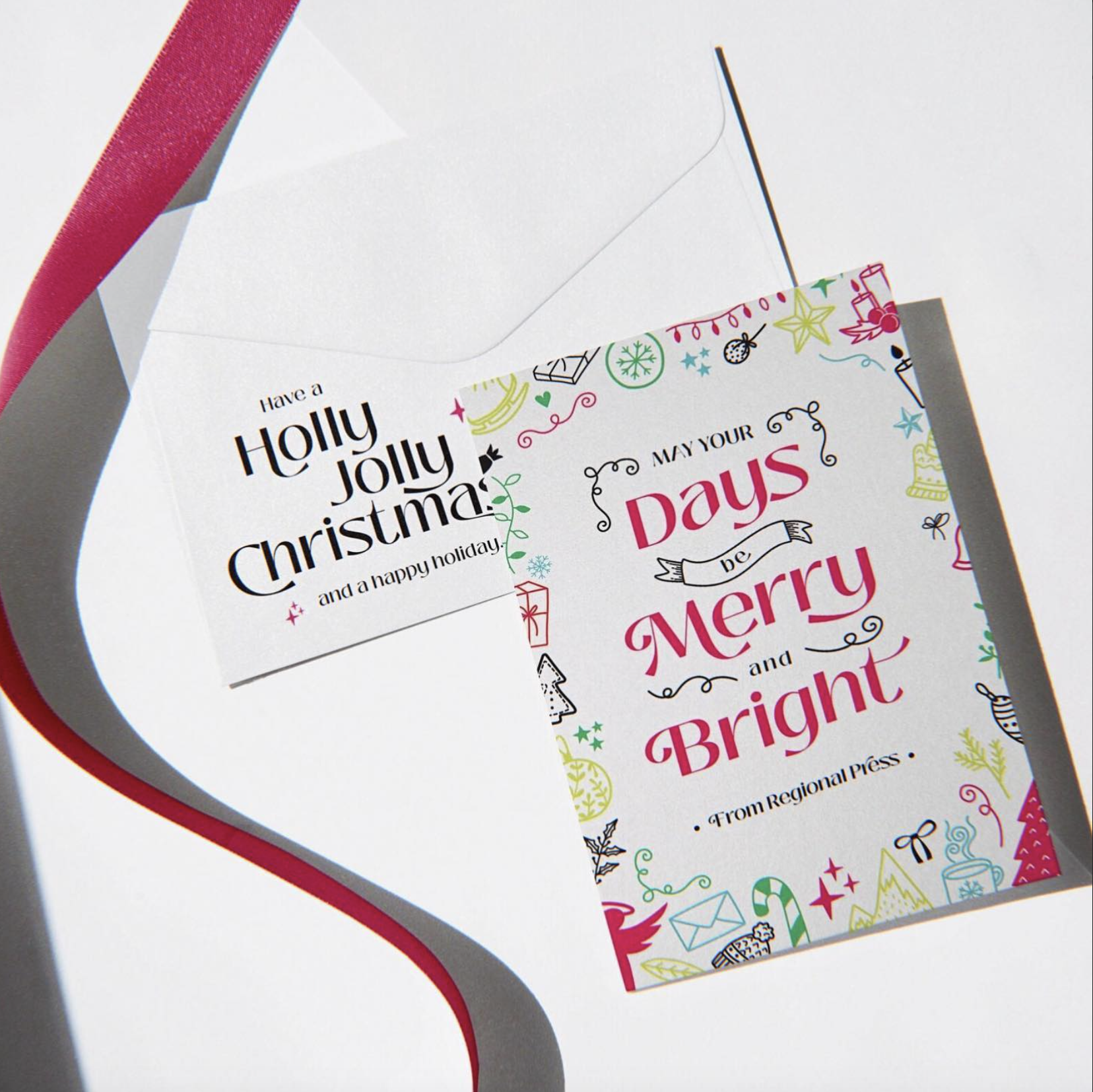
The company has just bought a new printer which had a feature where it could print certain colours more vividly than normal digital production printers. I was tasked to test this printer on our Christmas cards so our clients would know that they don't have to choose Pantone printing for orders that require vibrant colours but relatively small runs.
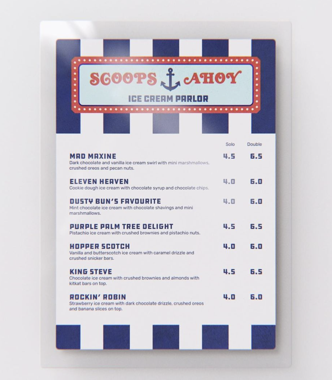
In the company's social media account, we regularly posted designs that used certain finishings so we could talk about them. For this one, it was hard lamination, which is often used for food menus.
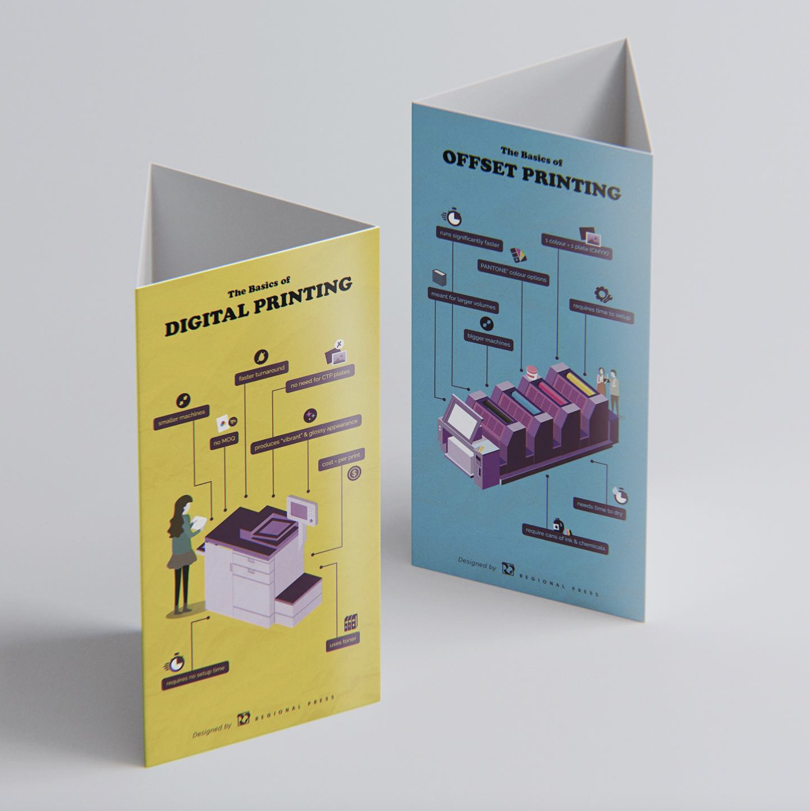
My boss at the time voiced out one of his dilemmas to me, which was explaining the same things over and over again when doing his sales pitches in the meeting room. To help our sales department, I made these tri-fold 'table talkers' that featured simple infographics covering the differences between the different types of printing.
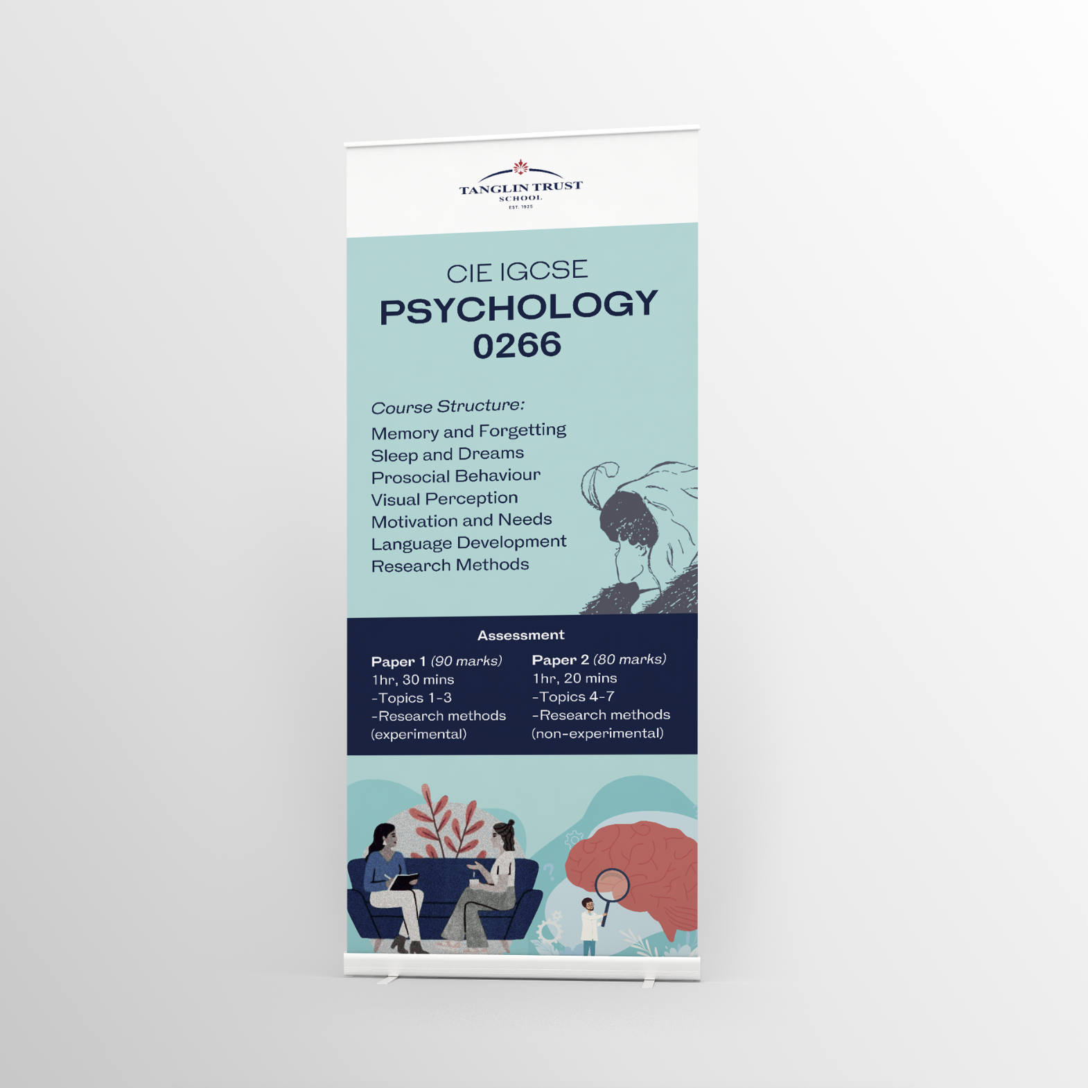
As another one of my freelance projects, I produced this pull-up banner for Tanglin Trust School's Psychology Department.
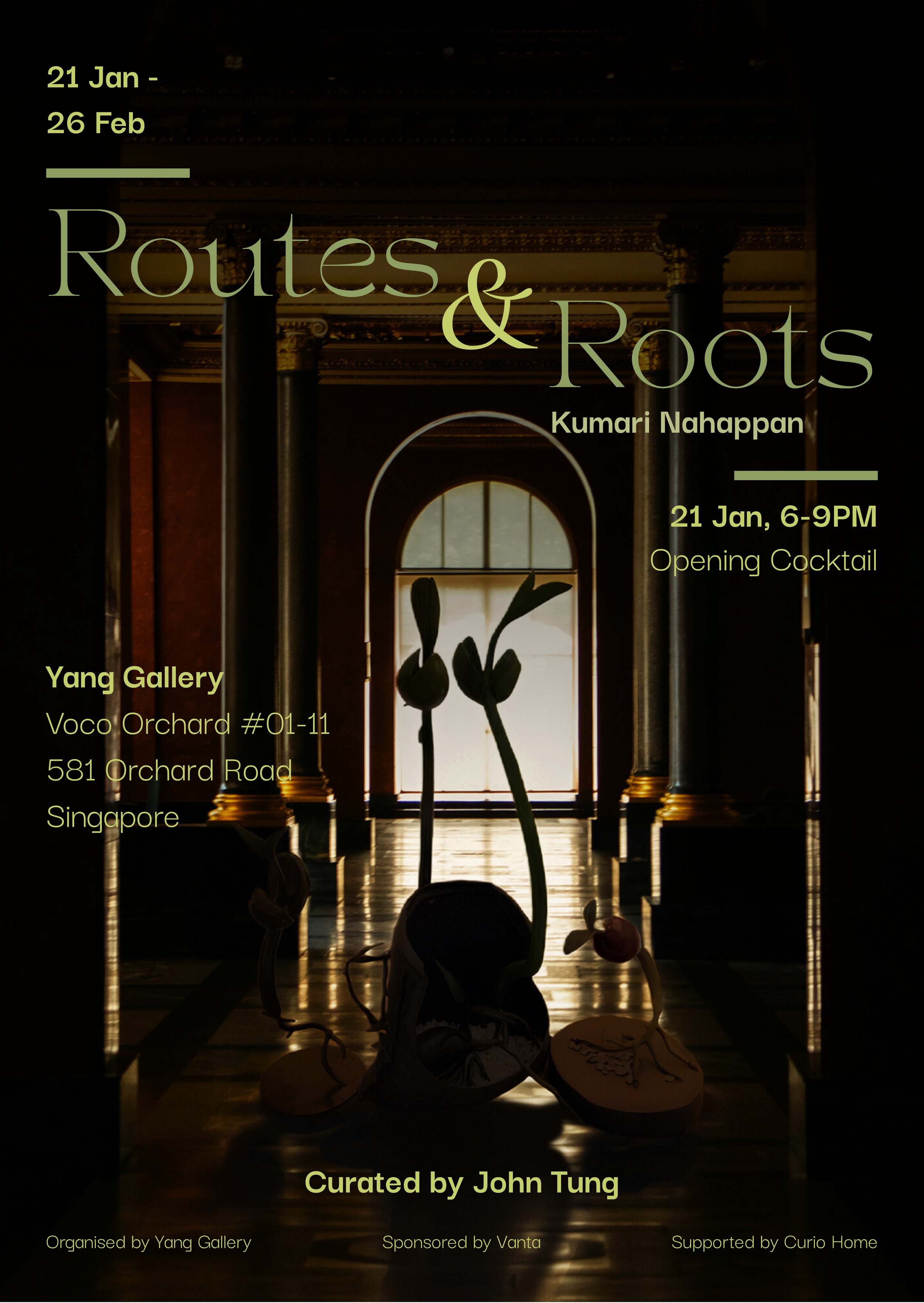
This is one of three iterations I've designed for Kumari Nahappan's show during ARTSG called, Routes & Roots.
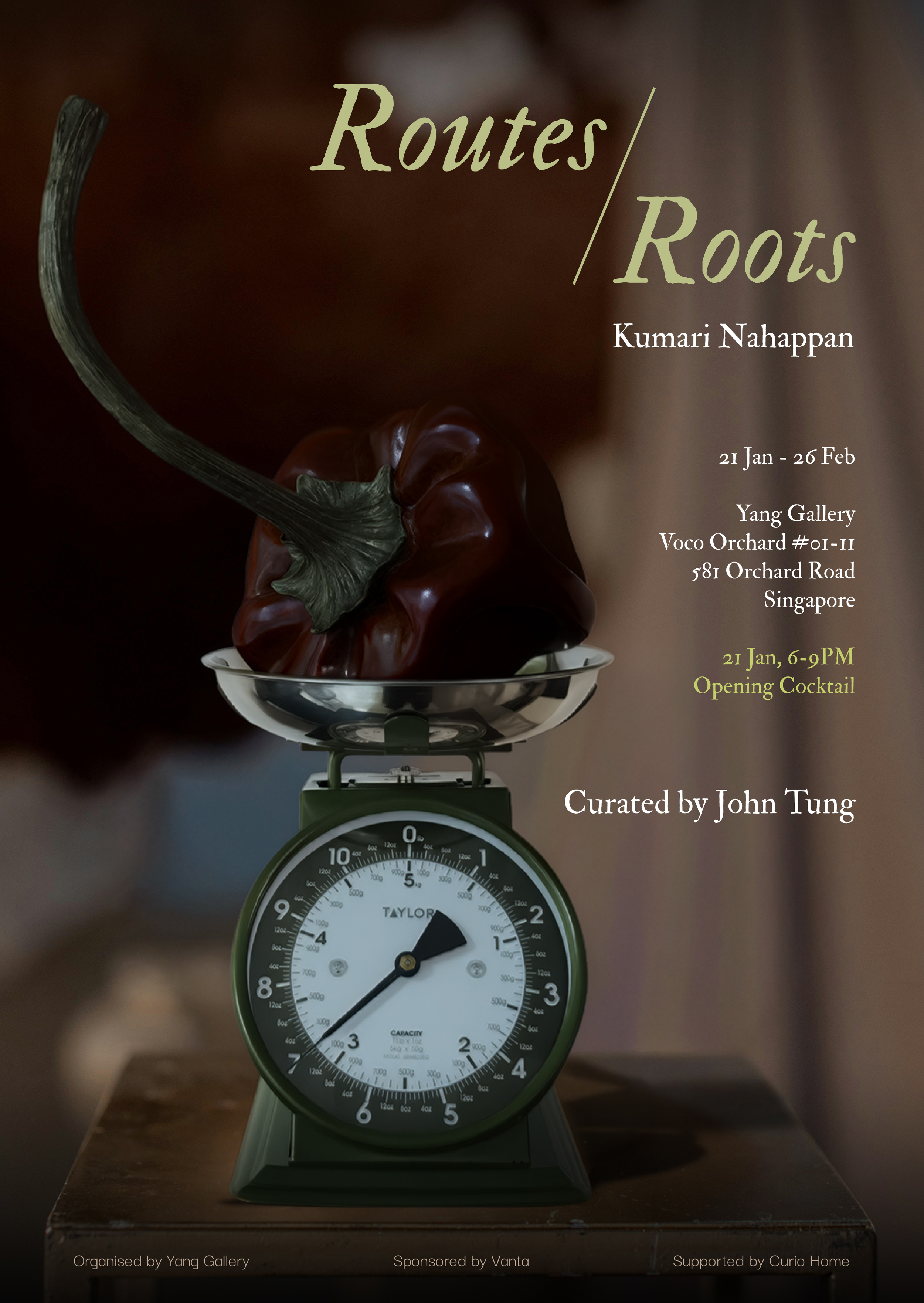
This is one of three iterations I've designed for Kumari Nahappan's show during ARTSG called, Routes & Roots.
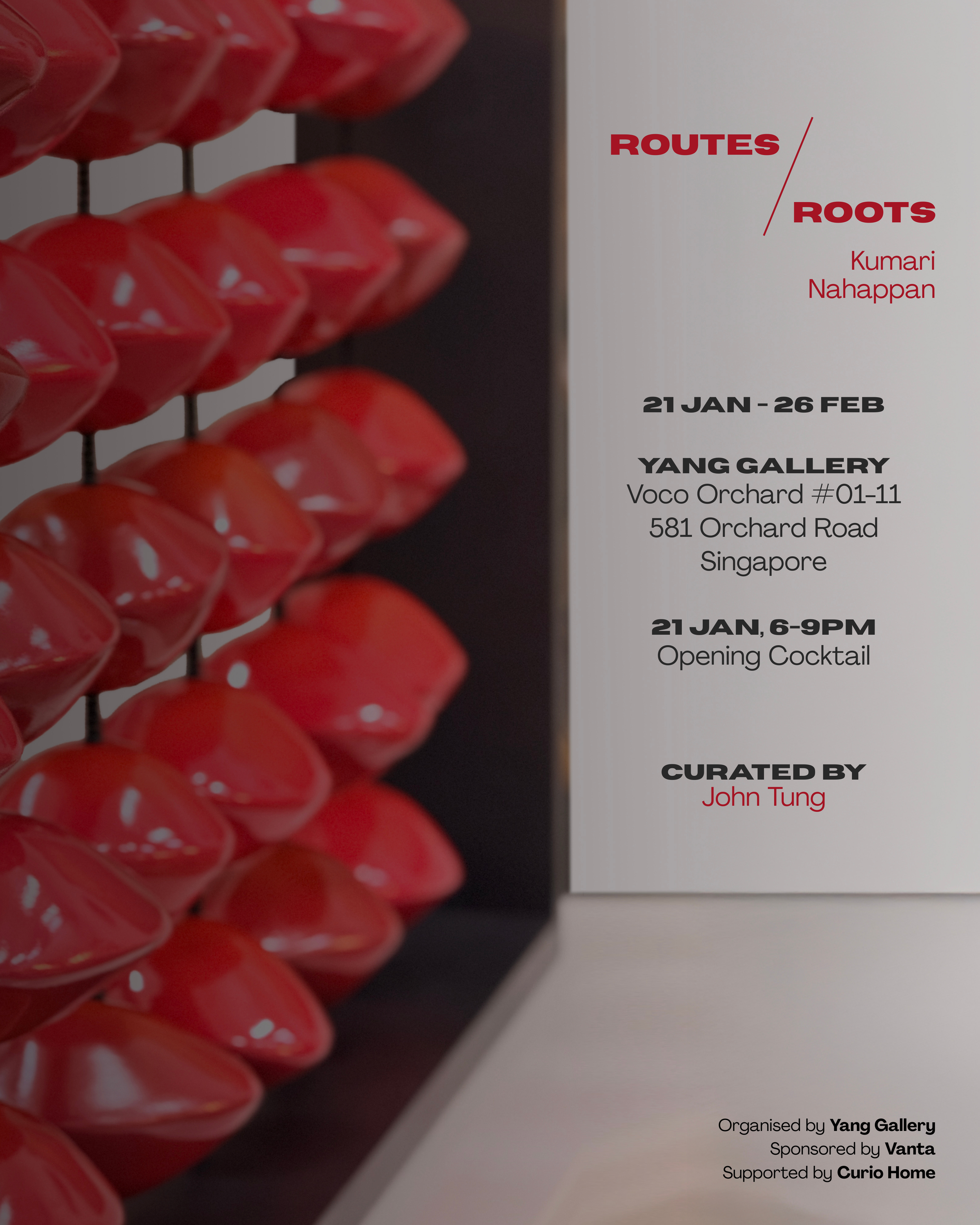
This is one of three iterations I've designed for Kumari Nahappan's show during ARTSG called, Routes & Roots.